
There have been news that facebook has rolled out its new navigation design that will enhance and simplify user experience.
Just this morning when I logged on to my facebook account, I saw a different smartly designed homepage.
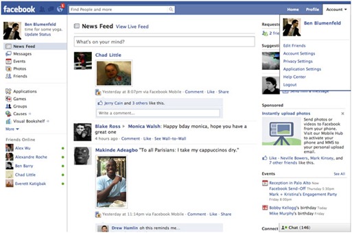
“In the top menu, you will find your newest notifications, requests and messages. For example, when you receive a Facebook notification about someone writing on your Wall or tagging you in a photo, you'll see a red bubble appear in the left-hand corner near the search bar. When you click on the icon, you'll see a drop-down menu with your most recent notifications. The Home and Profile links can now be found in the top-right corner along with your Account menu, which includes your privacy settings and the ability to log out.” – Jing Chen Facebook Engineer
When facebook revamped their home page last October, people didn’t like it very much. That drastic shift in design change has prompted some 600,000 members to join a Facebook page called PLEASE GIVE US OUR OLD NEWS FEED BACK!.
I think the facebook team got it right this time. Here’s why.
1. Messages, Photos, and Events have that real time news feed feel to it.
The left menu contains your messages, photos, events, and other core facebook feature. With this feature, you can now access your messages, browse your friends recent photo uploads, and up coming events your friends are attending.
2. Recent application activity filter.
If you don’t want to see your application activity flooding your wall, you can turn this off by going to to the privacy setting.
According to Chen, “We feel strongly that control is an important element of any information sharing on Facebook. That's why these features are launching with an entirely new privacy setting.”
3. The Chat feature is a lot smarter.
If you have a lot of friends who are online, facebook chat will only show you your friends who you communicate frequently. If you want to see all of your online friends, you can do this by clicking “See All” at the bottom of your left corner menu.
The new design makes more sense compared to the previous version and it looks cleaner and easier to understand. It might take a couple of days for me to get use to this. But after the unavoidable period of adjustment, it’ll be worth it.
Oh, here’s the new revamped facebook looks like on my account.


 Reviewed by Wicked Sago
on
10:30:00 AM
Rating:
Reviewed by Wicked Sago
on
10:30:00 AM
Rating:


No comments:
Note: Only a member of this blog may post a comment.